Take a moment to look around you.
Whether you’re scrolling through social media, browsing online stores, watching television, or walking through a shopping center, you’re surrounded by logos. Most of us recognize them instantly without giving them much thought. A simple symbol, a familiar color scheme, or a few letters are often enough to identify a brand in a fraction of a second.
But what appears simple on the surface is rarely simple at all.
Behind many of the world’s most recognizable logos lies a surprising blend of creativity, psychology, strategy, and visual storytelling. Every line, shape, color, and letter is often carefully chosen to communicate something about a company without using a single sentence. Once you begin paying closer attention, you’ll discover that some of the most familiar symbols in everyday life contain hidden meanings, clever design choices, and fascinating details that most people overlook.
More Than Just a Symbol
Creating a successful logo is far more difficult than it may seem.
A logo must be memorable enough to stand out, simple enough to be recognized instantly, and versatile enough to work everywhere—from giant billboards and storefront signs to tiny smartphone screens.
To achieve that balance, designers often combine multiple ideas into a single image.
Colors are selected for specific reasons. Blue may communicate trust and reliability. Red can suggest energy and excitement. Green often evokes growth, health, or sustainability.
Shapes matter too.
Rounded forms tend to feel friendly and approachable, while sharp angles can create impressions of strength, precision, or innovation.
Even typography plays a powerful role. The style, spacing, and structure of letters can influence how a brand is perceived long before someone consciously processes the words themselves.
Together, these elements create a visual identity that helps shape first impressions—often within seconds.
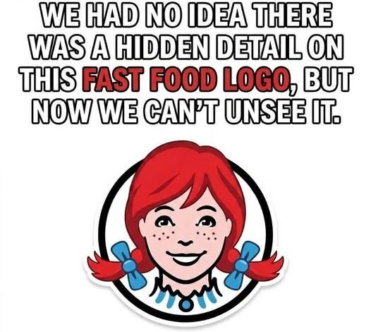
The Art of Hidden Meaning
One of the most fascinating aspects of logo design is the use of subtle visual techniques that many people never notice.
Designers frequently use negative space—the empty areas around and between shapes—to hide additional images or messages within a design.
Others incorporate visual illusions, symbolic references, or clever details connected to a company’s story and mission.
These hidden elements work because the human brain naturally enjoys discovering patterns.
When someone suddenly notices a concealed image or realizes there is more to a logo than they initially thought, it creates a small moment of surprise and satisfaction.
That emotional reaction helps make the logo more memorable.
It transforms a simple design into something people remember and talk about.
Many of the world’s most iconic logos have earned their status because they reward curiosity and invite a second look.
Why Great Logos Last
Not every logo survives the test of time.
Many are forgotten quickly.
The most successful designs endure because they communicate something deeper than a company name.
They tell a story.
Every organization wants to convey who it is, what it values, and how it wants to be perceived. A well-designed logo becomes the visual introduction to that story.
It creates an identity.
It establishes personality.
It builds recognition and trust over time.
The strongest logos often feel effortless, but that simplicity is usually the result of countless hours of refinement, experimentation, and creative problem-solving.
Behind every iconic symbol are designers carefully considering every detail—from color and proportion to symbolism and emotional impact.
Looking Beyond the Surface
The next time you encounter a familiar logo, take a closer look.
Examine the shapes.
Notice the spacing.
Pay attention to the colors.
Ask yourself why certain choices were made and what message the design might be communicating.
You may discover hidden meanings that have been sitting in plain sight for years.
More importantly, you’ll gain a deeper appreciation for the creativity and thought that shape the visual world around us.
What appears to be a simple symbol is often much more than that.
It is strategy, psychology, storytelling, and design working together to communicate an idea in a single glance.
And that is what makes great logos so powerful—they speak without saying a word.