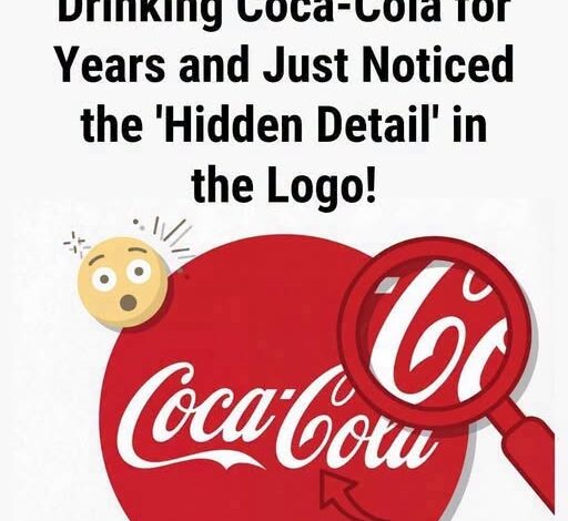
Most of us love the idea that famous logos contain hidden secrets.
We look for arrows tucked between letters, animals hiding in negative space, and symbols that seem invisible until someone points them out. Once we discover one clever detail, it becomes tempting to believe every iconic brand must have been designed as some elaborate visual puzzle.
The Coca-Cola logo is often part of that fascination.
People have spent years looking at its flowing lettering and sweeping underline, convinced that a hidden smile is deliberately built into the design. It sounds like the perfect explanation.
After all, Coca-Cola has spent generations connecting its brand with happiness, celebration, friendship, and shared memories.
So surely that smile must have been intentional.
But the historical story is much simpler.
The famous Coca-Cola script was created in the late nineteenth century by Frank Mason Robinson, the company’s bookkeeper and advertising manager. Robinson believed the two capital C’s would look particularly striking in advertising, and he chose Spencerian script—a popular handwriting style of the era known for its elegant, flowing appearance.
His goal was straightforward.
He wanted the name to look distinctive.
Elegant.
Memorable.
Easy to recognize on advertisements, signs, and product packaging.
There is no reliable historical evidence showing that Robinson deliberately hid a smile or secret symbol within the lettering. No surviving design notes or documented correspondence confirm that the sweeping line beneath the name was intended as a coded emotional message.
Instead, the famous appearance seems to have grown from something much more ordinary.
Beautiful handwriting.
Careful proportions.
And an appreciation for visual elegance.
Sometimes the real history is less mysterious than the story we want to believe.
But that doesn’t make the logo any less fascinating.
Because although the design itself has remained remarkably recognizable, the meaning attached to it has changed dramatically over time.
Advertising played a huge role in that transformation.
For generations, Coca-Cola appeared alongside family gatherings, holiday celebrations, picnics, sporting events, summer afternoons, and moments shared between friends. The brand gradually became associated with experiences that had little to do with the drink itself.
And those repeated experiences changed how people began to see the logo.
The sweeping curve beneath the lettering stopped looking like nothing more than a decorative flourish.
To many people, it began to resemble a smile.
Not necessarily because the designer intended it that way.
But because human brains are exceptionally good at finding familiar patterns.
We see faces in clouds.
Animals in unusual rock formations.
Expressions in the front of a car.
Two windows and a doorway suddenly become a face.
A simple curve beneath a word can start to look like a welcoming smile.
There is even a name for this tendency: pareidolia.
It describes our natural inclination to find recognizable patterns, particularly faces and expressions, in shapes that were never actually designed to contain them.
And when that tendency is combined with decades of positive memories, the effect becomes even stronger.
If a particular logo has repeatedly appeared during moments of happiness, celebration, comfort, or connection, our minds begin to associate the design itself with those emotions.
The logo may stay the same.
But our relationship with it changes.
That may be the most interesting part of the entire story.
Perhaps the famous “hidden smile” exists not because someone secretly drew one into the logo more than a century ago, but because generations of people gradually placed that meaning there themselves.
Every family dinner.
Every summer barbecue.
Every holiday celebration.
Every shared drink between friends.
Every nostalgic memory adds another layer to a design that was originally created simply to look distinctive and elegant.
In that sense, the Coca-Cola logo tells us something far more interesting than a story about graphic design.
It tells us something about ourselves.
We rarely experience the world exactly as it is.
We experience it through memory.
Through emotion.
Through expectation.
Over time, objects can absorb the stories we associate with them until those stories become almost impossible to separate from the objects themselves.
The graceful lettering that began as a stylish example of nineteenth-century handwriting eventually became a symbol of celebration, nostalgia, friendship, and happiness for millions of people around the world.
Not because those emotions were secretly hidden inside the letters.
Because people placed them there.
And perhaps that is the real secret behind the Coca-Cola logo.
Its greatest achievement was never hiding a smile.
It was becoming something people wanted to smile about.
The most meaningful symbols aren’t always the ones designers deliberately hide.
Sometimes, they are the meanings we create ourselves—one memory, one emotion, and one shared moment at a time.